Corporate Identity
Our visual identity is created to maximise the power of the Exact brand, making sure that we offer a coherent customer journey and contribute to the equity of the brand.
Rationale
The basis of Exact’s identity is professional, business-like, responsive and communicative. It shows a clear Exact signature while communicating through different channels, through different touchpoints and to a variety of audiences.
The key design property is the ‘backbone’. It is literally the backbone of all touchpoints. Whatever the messages and design elements (like photography or illustrations), the backbone is always there, defining the layout, creating a clear and sharp overall image, and making sure all elements find their logical place. The backbone enables flexibility and diversity, and makes sure the way we present ourselves is always recognisable, consistent and distinguished. It strengthens the positioning of Exact and increases the efficiency of our marketing and communication efforts. Whatever the purpose and the message, people will always recognise Exact.
Design system
The design system of Exact is flexible. Use the backbone to structure your content. If you add a photo to the design, the margin adapts with it. Always include the Exact logo.
Do you want to know how to judge resources on their appearance? Use this convenient checklist! Need help? You can always send new resources to Brand Management for advice. We are always happy to help.
The Exact grid
Our design system is inextricably linked to our grid; the invisible basis of all our expressions. This grid ensures that we build all our communications coherently and consistently. The grid system can be flexibly applied to all formats, both digital and print.
To help you start using the grid, we offer it in different formats to make it easier to apply.
Document grid
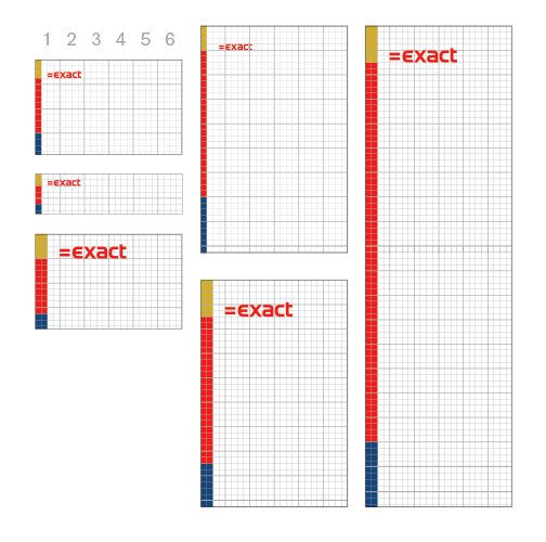
The Exact identity is based on a 6-square grid. It is calculated by dividing the width of the horizontal side of your medium by 6 and then by dividing the result of that by 4 for both landscape and portrait orientation.
The backbone
The backbone helps to add focus and structure to designed content. It is the backbone of the Exact design system that helps our designers to structure designs varying from print to online.
Backbone placement
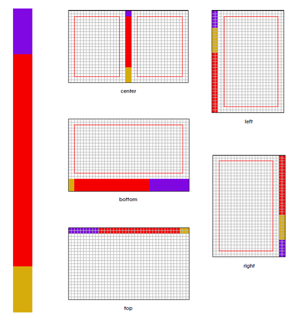
Always start by placing the backbone in your design on the grid. The backbone can be positioned vertically left, right or in the centre. Horizontally, the backbone can be placed at the top or bottom.
Backbone colour
You must always use Exact red for the backbone, along with 2 different secondary identity colours. It’s not possible to create a backbone with only 1 or 2 colours.
Backbone length
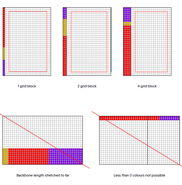
The backbone should always reach from the beginning to the end of an item. It cannot stop mid-way and should be cut off by the borders of the item. Online, there are exceptions, since a web page can be infinitely long.
Backbone width
We calculate the width of the backbone using the Exact grid. The minimal width for the backbone is 1 grid block. The maximum width of the backbone is 4 grid blocks.
Margin
The document margin is 2 grid blocks from the sides and from the backbone (see red line in the pages on the right).
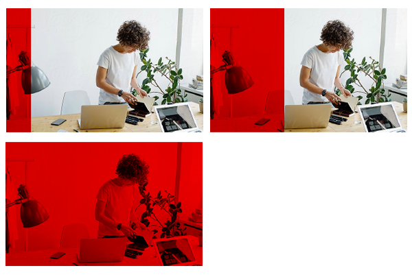
Transparency
When we use photography or video, we use the backbone to place the content. This part of the backbone should reach the same height or width as the content box. We overlay this part of the backbone on top of the content in ‘multiply’. By doing this, the backbone becomes transparent and the content will be visible in the same colour as the backbone. The backbone can increase in size (see example).
Brand Elements
Logo
The Exact logo consists of our wordmark (=Exact). The equal sign symbolises the precision in everything we do. We are proud of our logo. Use the logo with due care and do not be modest. It loves to stand out.
The primary logo colour combinations are a red logo on a white background or in diapositive.
Exceptions
In some cases, it is also possible to use the logo on black or grey.
Bounding box
The bounding box consists of 3 vertical rows of blocks (see example). Always keep at least 1 block of empty space between the logo and other elements.
Logo on photography
On photographs, we use a red or white logo, depending on the contrast. The logo should always be legible.
Logo in video
All films and videos end with the standard indent (our logo). Other guidelines are in the brand guide.
Want to download and use the logos yourself?
If you want to download and use the logo in assets yourself, please take a look at the Exact asset bank. Here you can download the exact logo packages.
If you want to use the logo for print purposes, please use the CMYK version. And if you want to use the logo for digital purposes, please use the RGB version of the logo.
Partner logos
For partner logos, we use the main Exact logo in combination with a specific partner name. For now, all the partner partner names fit in one line. If in the future a new partner logo is added with a longer name it can be placed on 2 lines. In some cases, for example the “powered by” logo, we place the name of the application above the exact logo. The partner name can be left aligned or centered.
Event logos
For an event logo, we use the main Exact logo in combination with the name of event. To differentiate the event name from other typographical content, we choose one of the secondary colours for the event name.
Sometimes the Exact logo needs to communicate more than the name of the event, and other times, it may be the other way around. Also, the items used to dress an event are so diverse that the logos should be able to adapt to different situations. This is why the Exact event logo is dynamic. The font size and positioning of the event name can be adjusted freely. Please always allow adequate space between the Exact logo and event name.
Colour
Colour is a powerful component of any design system. It is often the first-perceived attribute of a brand and creates an undeniable first impression in the minds of the audience. Colour can be used to create excitement, set a mood and express personality. The Exact colour palette is composed of primary colours and a set of secondary colours. For websites, a specific colour palette is created (see RGB colour shades).
Primary colors
Exact red is our primary colour and should always be your first choice. This red comes in 3 variations. The red range is to be used for all communication. Red is the leading colour above white, grey and black.
Red #e1141d C0 M100 Y100 K0
White
#ffffff
C0 M0 Y0 K0
Black
#000000
C0 M0 Y0
Grey
#dadede
C13 M7 Y9 K0
Secondary colors
The Exact identity consists of a range of 4 secondary colours. These colours give the opportunity to add emotion to the Exact identity. Exact purple and ochre yellow represent a fresh young and dynamic appearance. Dark blue and brown we use for more mature and business-oriented designs. The colours can be combined in order to visualise the right feeling.
Purple PMS: 2097 C RGB #8200DF C75 M100 Y0 K0
Ochre yellow PMS: 110 C RGB #DBAE29 C20 M30 Y100 K0
Brown PMS: 7530 C RGB #BAA488 C28 M33 Y48 K0
Blue PMS: 654 C RGB #00467B C100 M79 Y27 K11
RGB color shades
For web only, the Exact identity colours comes in a range of 2 extra tints. These RGB colours enable us to make more subtle web designs with a broader colour range.
hex: #7f2320
class:
bg-red-100
fg-red-100
hex: #9c1f1e
class:
bg-red-80
fg-red-80
hex: #e1141d
class:
bg-red-60
fg-red-60
hex:#F9D0D2
class:
bg-red-40
fg-red-40
hex:#FCE7E8
class:
bg-red-20
fg-red-20
hex: #000000
class:
bg-black-100
fg-black-100
hex: #333333
class:
bg-black-80
fg-black-80
hex: #666666
class:
bg-black-60
fg-black-60
hex: #999999
class:
bg-black-40
fg-black-40
hex: #CCCCCC
class:
bg-black-20
fg-black-20
hex: #787a7a
class:
bg-grey-100
fg-grey-100
hex: #939595
class:
bg-grey-80
fg-grey-80
hex: #a5a9a9
class:
bg-grey-60
fg-grey-60
hex: #c9caca
class:
bg-grey-40
fg-grey-40
hex: #dadede
class:
bg-grey-20
fg-grey-20
hex: #baa488
class:
bg-beige-100
fg-beige-100
hex: #c8b6a0
class:
bg-beige-80
fg-beige-80
hex: #d7ccbd
class:
bg-beige-60
fg-beige-60
hex: #e3dbcf
class:
bg-beige-40
fg-beige-40
hex: #f8f5f3
class:
bg-beige-20
fg-beige-20
hex: #dbae29
class:
bg-mustard-100
fg-mustard-100
hex: #e2be54
class:
bg-mustard-80
fg-mustard-80
hex: #ebd186
class:
bg-mustard-60
fg-mustard-60
hex: #f1dfa9
class:
bg-mustard-40
fg-mustard-40
hex: #f9f2dc
class:
bg-mustard-20
fg-mustard-20
hex: #8200df
class:
bg-purple-100
fg-purple-100
hex: #9b33e5
class:
bg-purple-80
fg-purple-80
hex: #ba83eb
class:
bg-purple-60
fg-purple-60
hex: #cd99f2
class:
bg-purple-40
fg-purple-40
hex: #f2e7fb
class:
bg-purple-20
fg-purple-20
hex: #00467b
class:
bg-navy-100
fg-navy-100
hex: #336b95
class:
bg-navy-80
fg-navy-80
hex: #7e9eb7
class:
bg-navy-60
fg-navy-60
hex: #cbd8e2
class:
bg-navy-40
fg-navy-40
hex: #e6ecf1
class:
bg-navy-20
fg-navy-20
Call to action
To create a high contrast between the identity colours and buttons that need attention, the Exact identity uses a bright positive blue for CTA buttons.
Button primary
Primary
hex default: #0650D0
hex hover: #3873D9
hex active: #0442AE
hex color: #FFFFFF
class: btn btn-blue
Button secondary
Secondary
hex default: #CDDCF6
hex hover: #E3E8FA
hex active: #B4CAF0
hex color: #B4CAF0
class: btn btn-light-blue
Blue text link
This is a link
hex default: #0650D0
hex hover: #6A96E3
class: btn link-blue
White text link
This is a link
hex default: #FFFFFF
hex hover: #FFFFFF
class: btn link-white
Typography
Typography is used to differentiate sections of information or to emphasise a word or phrase. Used effectively, typography draws the reader’s attention, leads them to the most important information first and maintains a sense of clarity, order, legibility and structure throughout your written communication.
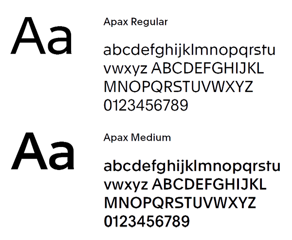
The selected typeface for Exact is the Apax. It has a playful, inviting look. Creative agencies and partners order the font themselves. This way, licenses are always guaranteed.
Apax
The Apax family is available in 6 styles and their matching italics. For the Exact identity, we use 2 weights from the family: Apax Regular and Apax Medium.
Choosing from this combination of weights, you can use Apax to create a clear, consistent visual hierarchy.
Apax Regular, Medium and other weights (if needed) are available for purchase at www.optimo.ch
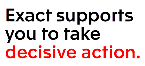
Header highlighting
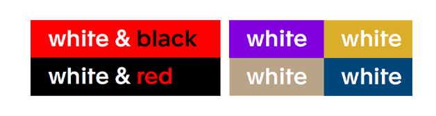
The Exact product helps you to focus and to see what is important. To reflect this principle, we use a red highlight in headers. Highlighting typography is only possible on white, red or black backgrounds.
Secondary colour backgrounds
If we use typography on top of a secondary-coloured background, we only use white. Typography cannot be used in secondary identity colours.
Seconday typeface
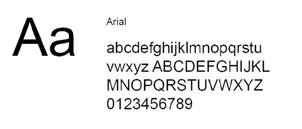
For the Exact product, internal presentations, online presence and internal documents such as Microsoft® Office applications, we use the typeface Arial.
Icons
The Exact communication icons must always be flat and outlined. When designing your own icons, always stay within the look and feel of the Exact brand. And always make sure these icons are suitable for use in different formats.
Communication icons
We use this icon style to explain a story. Do not use these icons for functional purposes such as navigation.
Highlighting an icon
To highlight an important part of the icon, we use one of the Exact identity colours.
Colour background
The same colour highlighting rules for typography are applied to icons. It is only possible to highlight on primary colour backgrounds. In case of secondary colour backgrounds, we use the icons in white or black.
Functional icons
Sometimes we use icons for more practical reasons. If an icon needs to be very small, it must be bold and solid to ensure that it remains functional. A complicated design does not work in this case. For this reason, we use the Font Awesome icon set.
Product icons
It is important that the set of app logos are recognisable together as a whole and at the same time they must clearly differ from each other. All designs can be derived from shapes from the Exact logo.
Specific style elements such as round corners, the thickness of the lines and the amount of degrees of the oblique lines (53) form the basics of the app logos. Furthermore, all icons consist as much as possible of a maximum of 1 or 2 lines. Multiple lines are only allowed if this is really necessary or more logical.
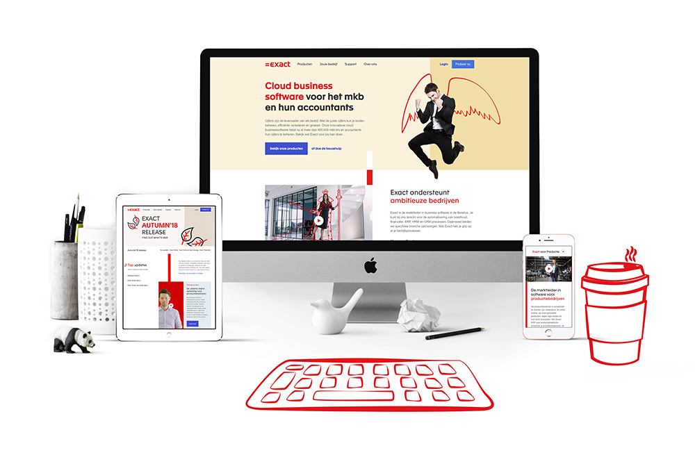
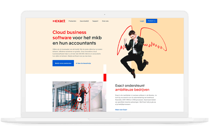
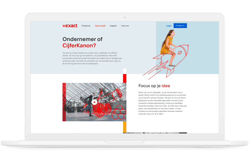
Imagery
Photography is an important means to create a brand that stands out. Our distinctive photographic style brings the Exact brand to life. Ensuring a consistent style and quality of photography strengthens the brand across all media. Our images should not merely repeat what our words already say. They should also avoid resorting to business clichés. It should create a broader canvas, sketching the Exact world and attitude.
Guiding principles
For all Exact photography, we use pictures with as much natural lightning as possible. Models wear clothes (preferably red and otherwise purple or ochre) appropriate for their work and workplace. The pictures are warm and colourful and the environment has accents of red in it. Pictures must feel natural—never too posed or over the top.
People
The people are portrayed in their own business setting, be it a cafe or an office. We focus on the variety of people and their different businesses, each with their own unique qualities and professionalism. By using depth of field we put emphasise on the subject, situation and our attention to detail.

Energy
At Exact communication is key. Therefore, we show the interaction and energy between people. They may be sharing a happy moment, having a laugh or collaborating. The pictures are warm and always have a positive atmosphere. They preferably always show at least two people, and the connection between the people is clear.

Technology
Pictures of technology are important for communication in some cases. For these, we always combine technology with a person who is actively using it (i.e., laptop, mobile device etc.). The pictures use detail photography, focusing only on the device and the person using it.

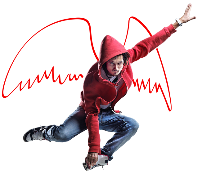
Doodle
If we want to express the Exact personality and add meaning to a photo, we use our own doodle photography style. The doodles add an extra fun and playful dimension to the image.
The first layer consists of the original photo depicting a person doing something. Choose a photo that communicates your message. We mainly use photos of customers in their work environment.
The second layer is a doodle drawing on top of the photo. Doodles are simple drawings or quick sketches. They do not have to be perfect. We always use red for doodle drawings.

Examples
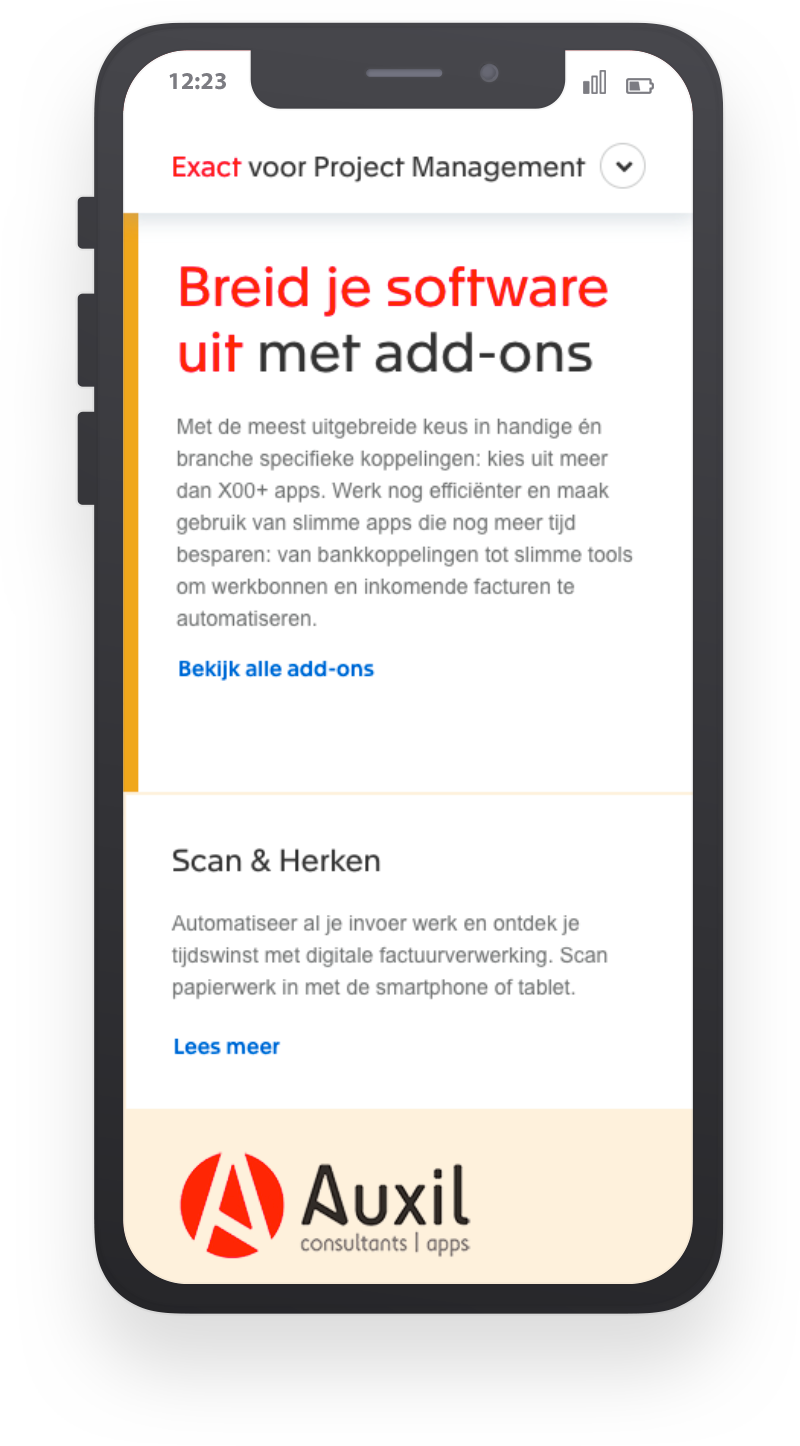
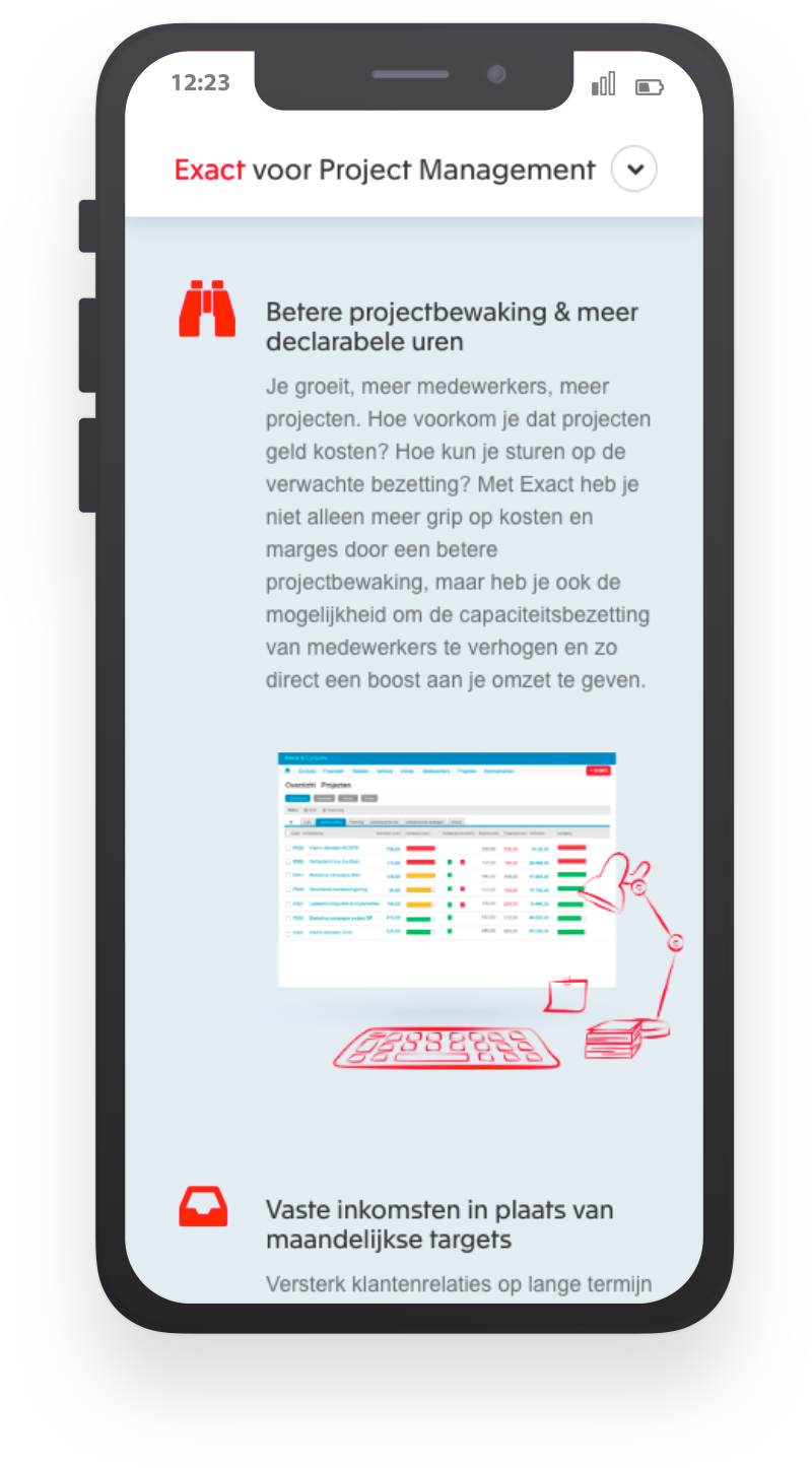
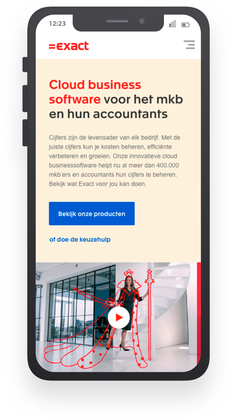
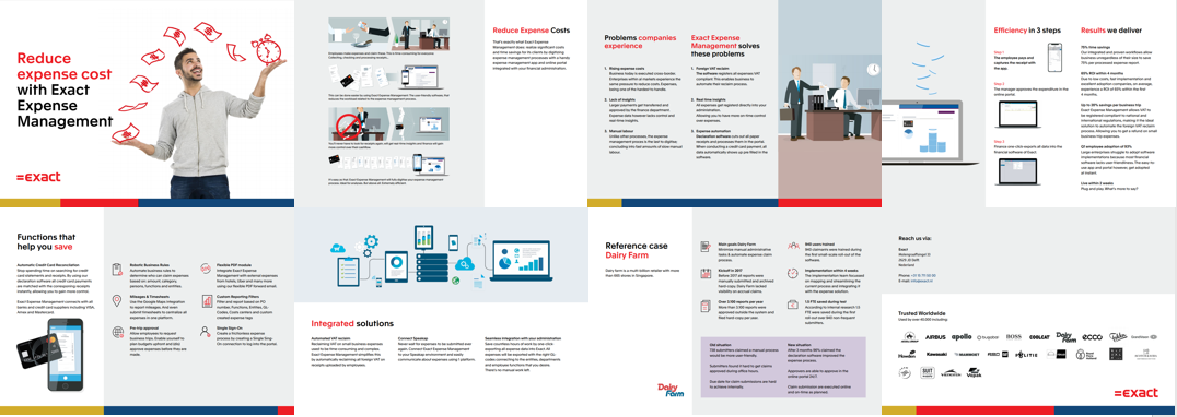
Our corporate identity offers a lot of room for variety. In fact, that’s exactly what we’re looking! It is great to know how big the box is before venturing out of it. Take a look at these examples and be inspired.
Digital

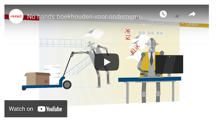
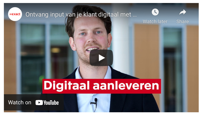
Video
Downloads
All available downloads in one overview. Do you still miss a document? Contact brand management.
- Checklist
- Exact logo: CMYK | RGB
- Partner logos
- The Exact asset bank